Background
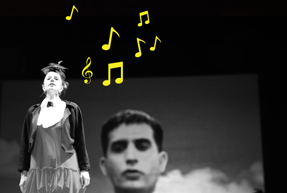
Mi Minor was an audience participant, interactive play which was performed in Istanbul in 2012-2013. The play was the first of its kind in the sense that it was an interactive play that could also be played as an RPG and followed through social media. This meant that the play relied heavily on digital mediums. The play was live-streamed on each performance and the public were given a chance to interact with each other as well as the Mi Minor team & actors online. This interactivity was also taking place in the venue with actors where there was no such separation between the stage, actor and the audience.
Challenge
The play had multiple layers that needed designing;
1. The play itself needed branding for marketing purposes.
2. The country called ‘Pinima’ within the play needed branding, which was applied to the performance to create the sense of a real country.
3. The heroine of the play needed an identity for the play’s dramaturgy.
The play, the Pinima Country and the Pianist also all needed to have website and social media accounts to accompany those.
Solution
1. The Play: Mi Minor
Mi Minor’s identity needed to be loud, but adaptable to different media, and instantly recognisable on digital mediums as well as print. Therefore the logo was designed as a simple yellow strip which can go along over images to communicate the play’s hidden theme of censorship. The logo was applied to posters and social media accounts. A website and a mobile application were designed to help the audience follow and interact with the play.
2. The Country: Pinima
The play was set in “the freedom in a box democracy” called ‘Pinima’. The idea was that the moment you enter the venue, you enter the country. The country being ruled by a fake democracy, we decided to give it a candy coated treatment. We gave the country its own identity and designed their national flag, money, newspapers, TV channels and so on. The colours of the country were chosen to stand out from real countries of the world. The money and flags were designed with the same cheeky approach like using the money as a photo album for the President.
3. The Pianist
The Pianist needed to be the voice of rebellion. It needed to be a guerrilla campaign of an individual who was trying to fight for her rights, so we created a virtually undesigned one-page website and made simple and quick visuals for it.


