Introducing Malaysian Street Food to Cardiff
Finally updated our work page! Which means we can finally talk about Jalan Malaysia’s re-branding…
It’s been such a long and rocky but enjoyable journey that I wanted to share a bit more of the illustration work (because they are amazing) and a bit more of the preparation that has gone into it…
Illustrations:
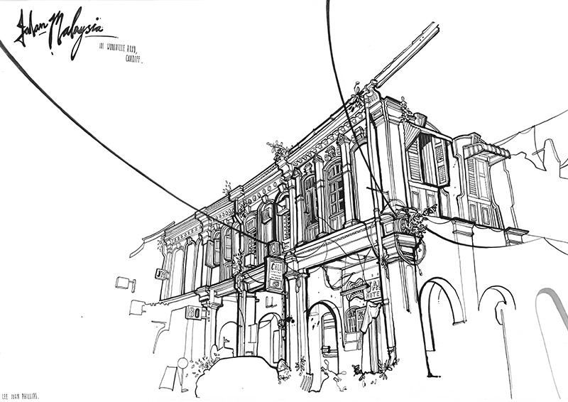
Lee John Philips has gone through many of these amazing drawings before we finalised the ones that were going to be used on the menu’s and walls… Check them out! (Click on images to view in full size)
Interior:
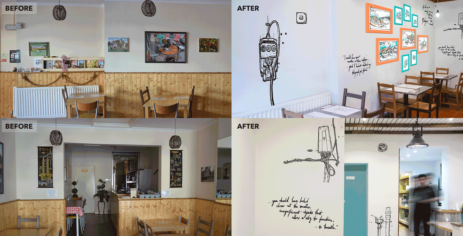
I painted these frames into the colours of the brand (how beautiful is that pumpkin orange) which unfortunately never made it to the wall. More on this later!
We completely stripped the whole place, sourcing the congested sheets were the most difficult! The light bulbs, cables and industrial lights are by: House by Betty (their shop is to die for).
We have also worked with the wonderful copywriter Jenny on getting the tone of voice right for menu’s.
We tasted so many beautiful food made my Teoh. If you haven’t already, you really must go and have some Malaysian food!
Update: I’m very sad to say that we had to stop working with Teoh, prior to the launch of the brand and the new restaurant as he needed to make some business changes. However, we are happy with what we have achieved so far and looking forward to seeing what’s next!
Here are some great reviews on the new Jalan Malaysia:


